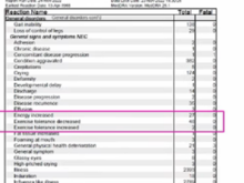
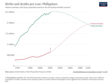
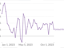
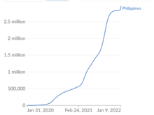
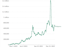
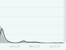
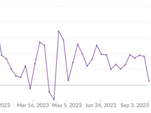
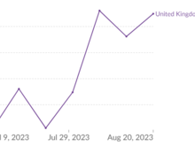
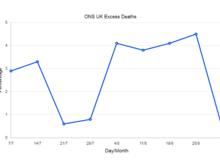
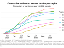
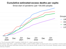
Dr Cam[bell tried to add his own input. And this time he used the very much respected Our World
In Data excess mortality graphs.But still highly
cherry picked countries. Though for once leaning out E Europe...perhaps someone told him their data is unreliable and also doesn't
support his agenda.
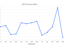
Still, he persists in showing Australia and NZ,
subject to a later pandemic, and Canada, who stopped releasing data 6 months ago!